Theme Customization
Override the default fellos theme to match your organization's brand colors and visual style.
The Theme page is found under APPEARANCE → Theme in the admin sidebar. fellos uses CSS custom properties (variables) for its visual styling, and this page lets you override the defaults to match your organization's branding. Changes appear immediately in the preview area, so you can experiment before saving.
How Theme Customization Works
fellos uses CSS custom properties (also called CSS variables) to control the visual appearance of the entire site. When you change a theme variable, every element that references that variable updates automatically. This means you can change the primary color once and see it applied to buttons, links, active sidebar items, badges, and more — all at once.
The Theme page provides a form-based interface for editing these variables. You don't need to write CSS — just pick colors using the color picker or enter hex values directly.
Theme Colors
The Theme Colors section is the heart of the page. It groups every theme variable into four labeled blocks. Each variable has a color swatch you can click to pick a color, plus a hex input for typing exact values.
CORE
- Page Background (
--color-background) — the main content area background. - Primary Text (
--color-foreground) — the default body text color. - Surface / Panels (
--color-surface) — sidebar, modals, and other surface backgrounds. - Card Background (
--color-card) — feed cards, profile cards, content panels. - Card Text (
--color-card-foreground) — text inside cards. - Emphasis Text (
--color-emphasis) — for headings and strong copy.
INTERACTIVE
- Primary / Accent (
--color-primary) — your main brand color. Affects active sidebar items, links, badges, and primary buttons. Start here. - Primary Foreground (
--color-primary-foreground) — text on top of the primary color (usually white). - Primary Hover (
--color-primary-hover) — the primary color on hover. - Secondary Background (
--color-secondary) and Secondary Text (--color-secondary-foreground) — for the secondary button style.
UI CHROME
- Muted / Hover (
--color-muted) and Muted Text (--color-muted-foreground) — for hover states and secondary copy. - Accent Highlight (
--color-accent) and Accent Foreground (--color-accent-foreground) — for highlighted UI like menu hover. - Borders (
--color-border) and Input Borders (--color-input) — control divider and form-field outlines. - Focus Ring (
--color-ring) — the keyboard-focus outline.
FEEDBACK
- Error / Destructive (
--color-destructive) and Destructive Text (--color-destructive-foreground) — for delete buttons and error states. - Success (
--color-success) and Success Text (--color-success-text) — for approvals and confirmations. - Warning (
--color-warning) and Warning Text (--color-warning-text) — for warnings. - Info (
--color-info) and Info Text (--color-info-text) — for info callouts.
You don't need to change every variable. Change Primary / Accent to match your brand color and leave the rest at their defaults — that single change cascades through buttons, links, badges, and active states. Fine-tune the others later if needed.
Palette Colors
Below Theme Colors is a Palette Colors section with twelve numbered swatches (palette-1 through palette-12). These are general-purpose accent colors used elsewhere in the product — for example, to color member-type badges, organization tags, or category chips. Set these once to a coherent palette so categorical color use stays on-brand across the site.
Typography
The Typography section lets you change the platform's font family. The default is Work Sans. Pick a font from the Font Family dropdown — a live sample (Aa, "The quick brown fox…", and the full alphabet) updates immediately so you can see how the new font reads.
Using the Color Picker
Each color variable has two input methods:
- Color swatch — click the colored square to open a visual color picker. Select your color and it's applied immediately in the Live Preview.
- Hex input — type a hex color code directly (e.g.,
#1a5276). This is useful when you have exact brand colors from a style guide.
Both methods update the preview in real time. Changes are not saved until you click Save Theme.
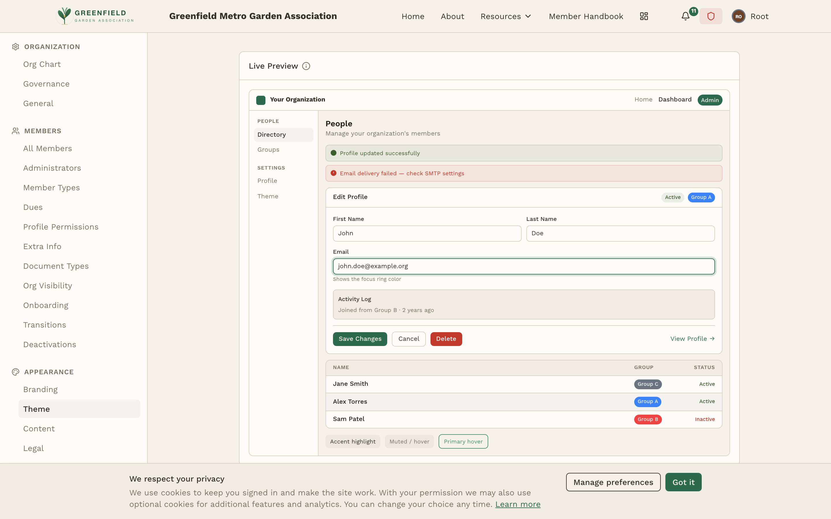
Live Preview
The Live Preview at the top of the Theme page shows a miniature version of the member-facing site with your current theme applied — header, sidebar with active item, a profile edit form with field labels, status badges, an activity log, a member directory table, and feedback toasts. As you change any variable, the preview updates instantly.
Resetting the Theme
To revert to the default fellos theme, click the Reset Defaults button at the top of the Theme Colors section. This clears all your custom overrides and restores the original color scheme. The preview updates to show the defaults — click Save Theme to apply the reset.
Resetting removes all customizations — there's no "undo." If you've spent time customizing your theme, consider noting your hex values before resetting. Theme changes are recorded in the audit log, so you can reference previous values there if needed.
When choosing colors, ensure sufficient contrast for accessibility. Text should be readable against its background — dark text on light backgrounds, or light text on dark backgrounds. The default fellos theme has been designed with accessibility in mind.